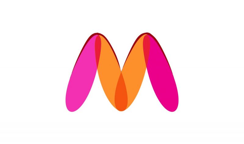
Myntra To Change Its Logo After Woman Complaint That It’s ‘Offensive’
In one bizarre news, the e-commerce platform, Myntra, has decided to change the brand’s logo after a woman lodged a complaint against the same. The woman in her complaint said that the logo was ‘offensive’ towards women and thus must go.
The offensive in the logo (if still unaware) is probably the ‘M’ which the woman, who has filed the complaint, believes looks like a ‘woman is spreading her legs’ (yes congratulation, we too are noticing it for the first time).

Also Read: Microsoft’s New ‘Taj Mahal’ Inspired Office In Noida Will Inspire You To ‘Work From Office’
So basically, we all must stop using the letter M from today, cuz duh, it’s offensive. And yes, to all the people whose names start with ‘M’, change it!!
The so-called offensive information, that most of you must have had never even noticed, (probably) was highlighted by the woman named Naaz Patel. Naaz works with an NGO called Avesta Foundation and had raised the issue (such a serious issue by God!!) at various forums.
“We found that the logo was offensive in nature for women. Following the complaint, we sent an email to Myntra and their officials came and met us. The officials said they will change the logo in a month’s time,” said DCP Rashmi Karandikar, Cyber Crime Department of Mumbai police.
Also Read: In A First, India’s First Igloo Cafe Comes Up In Kashmir Valley, See Pictures
Taking note of the complaint (why?), Myntra said that it would revise its logo on the website, app and as well as on all packaging material. They have already issued printing orders for packaging material with the new logo.
Also, as the news went viral, reactions flooded and here are some:
Can’t unsee it every time I look at the logo after reading this ???
— Silly Point (@FarziCricketer) January 29, 2021
?? I have been looking at this logo for so long never found it vulgar. Been shopping from Myntra for years seen its logo for so many years.
— KS (@Khushboosinha19) January 29, 2021
I am ordering from Myntra from years. Never saw this logo the way you are seeing. Soch badlo.
— Sunil Patil ?? (@sunilmpatil) January 29, 2021
We never noticed it. But, they did. This shows that more issue is in their thinking, than in the logo.
— Ritesh Mahato (@Ritesh_7l) January 29, 2021
Lol, some idiots have so much of dirt in their minds. I guess myntra has been around for almost 10 years and never once did it cross my mind that the logo of Myntra can denote something vulgar. Myntra should not succumb to the idiots
— Varun (@VarunSi17011029) January 29, 2021
McDonald’s must be scared, very scared.


